The key points of reference for comparison are the ignition lock for height and fork centres for width. The bars are also the same length and have the same pull-back angle so help to show how the two variants of the Hinckley T300 project relate to one another. Bars can be changed though so there is potential variability. In fact, the height of the bars is one of the main things that define what they are like to ride for pitching the rider's weight forward and more behind the screen, or backward/upright and more in the air.
|
|
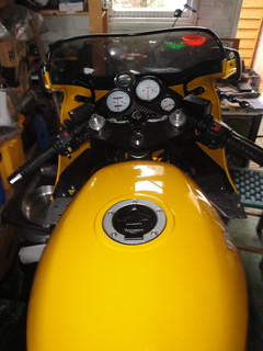
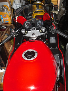
| 1994 Daytona Cockpit | 1991 Trophy Cockpit |
The screens are both standard fitments for their years. The Daytona screen is marginally lower than the Trophy. The Daytona bars are mounted beneath the top yoke, the Trophy's are above, a difference of about 2 inches. The effect of bar and screen height when riding is that the Daytona keeps more of the wind off but directs windblast into the middle of my helmet. I'm 6'4'' though so it's conceivable a shorter rider would be out of the wind altogether ... if they could reach across the long tank to get hold of them in the first place!
I have found when riding the Trophy that my shoulders are just in the wind but the wind blast off of the screen hits me around the top of the chest. My helmet is in clear air so it's much quieter because there is less buffeting and the volume of wind hitting the helmet is lower.
The Daytona cockpit isn't quite standard - I made my own carbon fibre clock bracket to the same dimensions as the original and fitted a time clock just above the speedo.
2 comments:
I do like that red on the Trophy. You hardly notice the fairing at the side of the screen on mine but it's very prominent on yours. I like it!
Cheers. I'm liking the red too. Although the finish on the early bikes isn't as robust as the mid-90s ones, I love the colours. The basic paintwork seems good to me. The stickers on the bodywork are flimsy though.
If I come up on the lottery, maybe I'll ask Dream Machine to repaint the whole thing in the original scheme but, well, using paint instead of vinyl.
Post a Comment